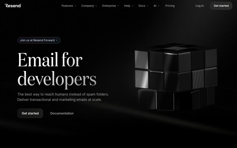
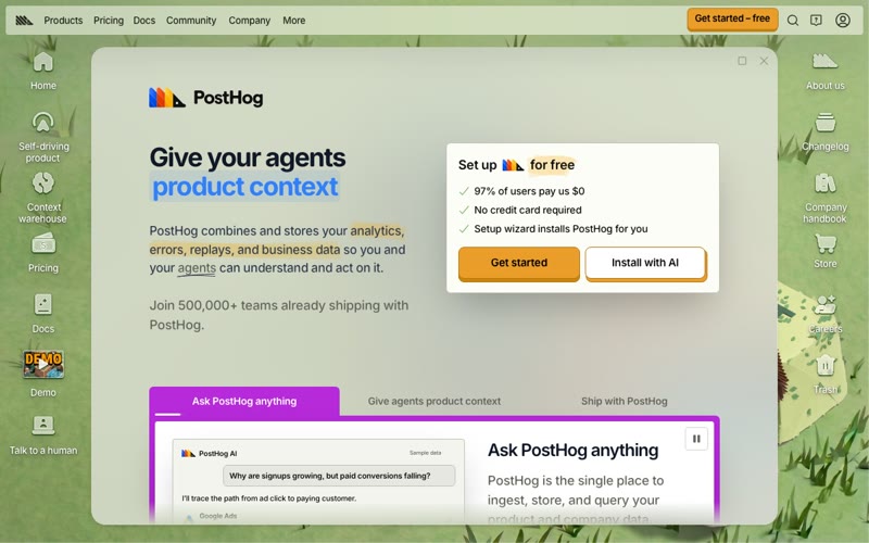
Vercel — Design Reference
gallery-white monolith, one black prism
Source: https://vercel.com
Theme: light
Category: Infrastructure
Mood: light, minimal, monochrome, precise, typographic, airy
Captured: 2026-09-13
Overview
A near-silent, gallery-like interface: an off-white #fafafa canvas, charcoal #171717 type and a single soft-shadowed black triangle doing all the visual work. Nothing is decorated. Hierarchy comes from very large, tightly tracked Geist headlines set against a lot of empty space, with small, precise controls tucked into the corners. It feels like an engineering tool presented as an art object. It is confident and quiet, and almost fully monochrome.
Technically it is a strict greyscale ramp (#fafafa → #ffffff → #ebebeb → #666666 → #4d4d4d → #171717) set in GeistSans at the unusual 450 weight, with letter-spacing of about -0.06em on display sizes. Colour is kept for semantics and small product glyphs: blue #0070f3 for links and focus, green, amber and red for status. Instead of borders, surfaces are separated by 1px ring shadows (rgba(0,0,0,0.08)) plus a faint 2px drop. Primary CTAs are fully rounded charcoal pills, utility buttons use 6px corners, and white cards have 12px corners. Spacing sits on a 4px grid, with section gaps of 120px or more.
Tokens — Colors
| Name |
Value |
Token |
Role |
| Paper |
#fafafa |
--color-ds-background-200 |
Page background on every page. Also the fill for docs code/prompt panels and for the ring that sits outside card shadows. |
| Sheet |
#ffffff |
--color-ds-background-100 |
Raised surfaces: blog cards, docs feature cards, secondary buttons, the mobile menu overlay and the search field. |
| Hairline |
#ebebeb |
--color-ds-gray-200 |
1px separators and ring outlines on secondary buttons and inputs. Also used for dividers in docs and nav. |
| Mist |
#f2f2f2 |
--color-ds-gray-100 |
Selected filter chip ('All' on the blog), hover fills on ghost buttons and menu rows. |
| Ink |
#171717 |
--color-ds-gray-1000 |
Headlines, primary text, primary button fill (Deploy now, Sign Up, Get started). |
| Graphite |
#4d4d4d |
--color-ds-gray-900 |
Body copy, nav links, blog excerpts and mobile menu links. It is the most common text colour by character count. |
| Slate |
#666666 |
--color-accents-5 |
Secondary metadata: blog categories, docs sidebar group labels, captions. |
| Pewter |
#8f8f8f |
--color-ds-gray-700 |
Placeholder text, keyboard-shortcut hints (⌘K), disabled labels. |
| Void |
#000000 |
--color-geist-foreground |
The logo triangle and hero prism. In dark mode it becomes the page background. |
| Signal Blue |
#0070f3 |
--color-geist-link-color |
Links, focus ring (hsl 212 100% 48%), 'Beta' badges in the docs sidebar, active states. |
| Deploy Green |
#45a557 |
--color-ds-green-700 |
Success states, ready or deployed indicators, terminal highlights. |
| Build Amber |
#ff990a |
--color-ds-amber-700 |
Warning and building states, small status dots. |
| Error Red |
#e5484d |
--color-ds-red-700 |
Error states, failed deployments, destructive actions. |
Semantic roles
| Role |
Value |
| background |
#fafafa |
| surface |
#ffffff |
| surface raised |
#ffffff |
| border |
#ebebeb |
| text |
#171717 |
| text muted |
#666666 |
| primary |
#171717 |
| primary text |
#ffffff |
| accent |
#0070f3 |
| success |
#45a557 |
| warning |
#ff990a |
| danger |
#e5484d |
Tokens — Typography
- Display: Geist (400, 450, 500, 600) — fallbacks: Inter, -apple-system, Segoe UI, sans-serif. Loaded as 'GeistSans'. Headlines use 450 (sometimes 400 or 600) with very tight negative tracking of about -0.06em at 48px and up, and line-height 1.
- Body: Geist (400, 450, 500) — fallbacks: Inter, -apple-system, Segoe UI, sans-serif. Body is 16px/24px at 400. UI labels and buttons are 14px. Normal tracking at body sizes.
- Mono: Geist Mono (400, 450, 500) — fallbacks: JetBrains Mono, Menlo, Monaco, monospace. Used for terminal and code blocks, the rotating mobile hero subline ('For coding agents') and domain fragments like '.com'.
| Role |
Size |
Line height |
Weight |
Letter spacing |
Family |
| Display |
64px |
64px |
450 |
-3.84px |
display |
| H1 / Section |
56px |
56px |
450 |
-3.36px |
display |
| H2 / Page title |
48px |
56px |
450 |
-2.88px |
display |
| H3 / Feature |
40px |
48px |
450 |
-2.4px |
display |
| Card title |
32px |
40px |
450 |
-1.28px |
display |
| Title |
24px |
32px |
450 |
-0.96px |
display |
| Lead |
20px |
26px |
450 |
-0.4px |
body |
| Body |
16px |
24px |
400 |
normal |
body |
| Small / UI |
14px |
20px |
400 |
normal |
body |
| Mono code |
14px |
20px |
400 |
normal |
mono |
Tokens — Spacing & Layout
- Base unit: 4px
- Density: spacious
- Container max width: 1080px
- Section gap: 120px
- Card padding: 24px
- Scale: 2px, 4px, 6px, 8px, 12px, 16px, 24px, 32px, 48px, 56px, 96px, 120px
Tokens — Radius
| Element |
Value |
| Hero / primary CTA pills |
9999px |
| Filter chips, search field |
128px |
| Nav utility buttons (Get a Demo, Log In, Sign Up), docs buttons, code panels |
6px |
| Marketing and blog cards |
12px |
| Marketing images and embeds |
8px |
| Small tags and inline code |
4px |
| Avatars, icon buttons (RSS) |
50% |
Tokens — Shadows
| Name |
Value |
Usage |
| border |
0 0 0 1px rgba(0,0,0,0.08), 0 0 0 1px #fafafa |
Replaces CSS borders on docs cards, code panels and prompt boxes. |
| border-small |
0 0 0 1px rgba(0,0,0,0.08), 0px 2px 2px rgba(0,0,0,0.04), 0 0 0 1px #fafafa |
Secondary buttons, dropdown triggers, small floating cards. The default 'lifted' look. |
| border-medium |
0 0 0 1px rgba(0,0,0,0.08), 0px 2px 2px rgba(0,0,0,0.04), 0px 8px 8px -8px rgba(0,0,0,0.04), 0 0 0 1px #fafafa |
Hovered cards, embedded product screenshots. |
| menu |
0 0 0 1px rgba(0,0,0,0.08), 0px 1px 1px rgba(0,0,0,0.02), 0px 4px 8px -4px rgba(0,0,0,0.04), 0px 16px 24px -8px rgba(0,0,0,0.06) |
Nav mega-menus, popovers, dropdowns. |
| focus-ring |
0 0 0 2px #ffffff, 0 0 0 4px #0070f3 |
Keyboard focus on every interactive element. |
Components
Primary pill button (button)
| Property |
Value |
| background |
#171717 |
| color |
#ffffff |
| border |
none |
| radius |
9999px |
| padding |
0 18px (height 40px) |
| font size |
16px |
| font weight |
500 |
| shadow |
none |
| hover |
background #383838 |
Hero CTA ('Deploy now', 'View open positions'). May carry a 16px leading icon. In dark mode it inverts to #ededed with #0a0a0a text.
Secondary pill button (button)
| Property |
Value |
| background |
#ffffff |
| color |
#171717 |
| border |
none |
| radius |
9999px |
| padding |
0 18px (height 40px) |
| font size |
16px |
| font weight |
500 |
| shadow |
0 0 0 1px #ebebeb |
| hover |
background #f2f2f2 |
Always placed next to the primary pill with an 8–12px gap ('Talk to sales').
Nav utility button (button)
| Property |
Value |
| background |
#ffffff |
| color |
#171717 |
| border |
none |
| radius |
6px |
| padding |
6px 12px (height 32px) |
| font size |
14px |
| font weight |
500 |
| shadow |
0 0 0 1px rgba(0,0,0,0.08), 0px 2px 2px rgba(0,0,0,0.04) |
| hover |
background #f2f2f2 |
Header 'Get a Demo' / 'Log In' and docs 'Set up your agent'. The solid variant ('Sign Up', 'Get started') uses #171717 fill with white text and no ring.
Filter chip (badge)
| Property |
Value |
| background |
transparent (active: #f2f2f2) |
| color |
#171717 |
| border |
none |
| radius |
128px |
| padding |
8px 12px (height 36px) |
| font size |
14px |
| font weight |
400 |
| shadow |
none |
| hover |
background #f2f2f2 |
Blog category row. Only the active chip gets a fill.
Search input (input)
| Property |
Value |
| background |
#fafafa |
| color |
#171717 |
| border |
none |
| radius |
128px (blog) / 6px (docs) |
| padding |
0 12px (height 32px) |
| font size |
14px |
| font weight |
400 |
| shadow |
0 0 0 1px #ebebeb |
| hover |
focus: 0 0 0 2px #fff, 0 0 0 4px #0070f3 |
14px leading magnifier icon in #8f8f8f and placeholder 'Search…'. The docs version adds a right-aligned ⌘K keycap chip.
Content card (card)
| Property |
Value |
| background |
#ffffff |
| color |
#171717 |
| border |
none |
| radius |
12px |
| padding |
24px |
| shadow |
none |
| hover |
0 0 0 1px rgba(0,0,0,0.08), 0px 2px 2px rgba(0,0,0,0.04) |
Tall blog cards, white on the #fafafa page with no outline. Layout: a 14px date plus a #666 category, a 32px/-1.28px title, a large empty gap, a 14px #4d4d4d excerpt, then overlapping 20px avatars.
Docs panel / code block (card)
| Property |
Value |
| background |
#ffffff |
| color |
#171717 |
| border |
none |
| radius |
6px |
| padding |
16px 20px |
| shadow |
0 0 0 1px rgba(0,0,0,0.08), 0 0 0 1px #fafafa |
| hover |
none |
Header strip with an icon, a label ('terminal', 'Agent Prompt') and a copy button, then Geist Mono 14px content. Command flags are tinted green.
Top navigation (nav)
| Property |
Value |
| background |
transparent (#fafafacc when scrolled) |
| color |
#4d4d4d (hover #171717) |
| border |
none (scrolled: 0 1px 0 0 rgba(0,0,0,0.1)) |
| radius |
0 |
| padding |
0 24px (height 64px) |
| font size |
14px |
| font weight |
400 |
| shadow |
none |
| hover |
text #171717, background #f2f2f2 pill on the link |
Sticky. Order is black triangle logo, then 'Products ⌄ Resources ⌄ Enterprise Pricing', then right-aligned Get a Demo / Log In / Sign Up.
Layout
The canvas is centred and roughly 1080px wide, while the header and hero bleed out to about 24px page margins. The hero is a three-column split: headline and CTAs on the left, a centred black prism with a soft radial glow, and a stacked list of three short statements on the right. A grayscale customer-logo row follows. Feature sections open with a two-line 56px headline, then an asymmetric composition of a product screenshot or embed next to a stat quote and a small 'Features' list. There is a lot of empty vertical space (120–170px) between sections. Docs use a 240px left sidebar with grouped links, a main column with a large H1 and a tabbed terminal panel on the right, then a three-up card grid. The blog is a three-column grid of tall white cards with 20px gutters.
Imagery
Very little imagery. The main visual is the black Vercel triangle with a soft blurred shadow halo on light and a white rim glow on dark. Otherwise the site uses real product UI (chat panels, customer site previews) framed in ring-shadowed cards, monochrome customer wordmarks, and 16px line icons such as >_, book and refresh. There is no photography or illustration, and gradients are limited to glows. Colour appears only in tiny product glyphs and status dots.
Motion
Understated and functional. The mobile hero subline cycles through mono phrases ('For coding agents' and others). The customer logo row scrolls as a marquee. The triangle's glow gives a quiet sense of depth. Buttons and links change background and colour over about 150ms ease. Mega-menus fade and scale slightly on open. Nothing bounces.
Responsive
On phones the desktop links collapse into a two-line hamburger icon at the top right, next to the triangle logo on the left. Opening it shows a full-screen white overlay with a close ×. Products, Resources, Enterprise and Pricing are listed as large (~32px) #4d4d4d links with chevron disclosures for the dropdowns. Below them sit three full-width stacked buttons with 6px corners: Get a Demo and Log In in white with a ring, Sign Up in solid #171717. The hero stacks vertically. The prism sits on top and fills most of the width, followed by a centred 'Agentic Infrastructure' headline that stays huge (~64px). The desktop three-line statement list turns into a single rotating Geist Mono subline. Both CTAs become full-width pills about 56px tall. The customer-logo row becomes a horizontally scrolling marquee cropped at the screen edges. Side margins shrink to about 36px, while vertical spacing stays generous.
Do
- Set headlines in Geist at weight 450 with line-height 1 and letter-spacing around -0.06em (-3.84px at 64px, -0.96px at 24px).
- Separate surfaces with 1px rgba(0,0,0,0.08) ring box-shadows, not CSS borders, and put white cards on a #fafafa page.
- Use fully rounded #171717 pills for the hero CTA pair and 6px-radius compact buttons for nav and utility actions.
- Keep the page greyscale. Use #0070f3 only for links and focus, and green, amber and red only for status.
- Leave large empty areas: 120px+ between sections, and let cards hold empty space between the title and the footer metadata.
- Use Geist Mono for terminal snippets, commands and tech labels, with a copy button in the panel header.
- Give every theme a true-black (#000000) dark counterpart with #ededed text and white glows instead of drop shadows.
Don't
- Don't add brand gradients, coloured backgrounds or illustrated heroes. One monochrome geometric object is the whole visual.
- Don't use bold 700+ weights or positive or normal tracking on large headlines. It breaks the chiselled Geist look.
- Don't use heavy or coloured drop shadows. Elevation should never go above about 6% black opacity.
- Don't round cards more than 12px or make nav buttons into pills. The radius system (6 / 12 / full) is deliberate.
- Don't use pure #000 for body text on light. Use #171717 for headings and #4d4d4d or #666666 for copy.
- Don't crowd the hero with badges, stats or multiple CTAs. The limit is one primary pill and one secondary pill.
Agent prompt
Build a minimal monochrome developer-platform UI in the Vercel/Geist style. Page background #fafafa, raised surfaces #ffffff, hairlines #ebebeb, fills #f2f2f2. Text: #171717 for headings, #4d4d4d for body, #666666 for meta, #8f8f8f for placeholders. Accent #0070f3 is for links and focus rings only (0 0 0 2px #fff, 0 0 0 4px #0070f3). Status colours: success #45a557, warning #ff990a, error #e5484d. Font: Geist (weights 400/450/500/600) with Geist Mono for code. Display 64px/64px weight 450 at -3.84px tracking, section H2 56px/-3.36px, card titles 32px/-1.28px, titles 24px/-0.96px, lead 20px, body 16px/24px, UI 14px. Use 1px ring box-shadows instead of borders (0 0 0 1px rgba(0,0,0,.08), 0 2px 2px rgba(0,0,0,.04)). Radii: hero CTAs are fully rounded pills (solid #171717 with white text next to a white ring-outlined pill), nav and utility buttons 6px at 32px tall, cards 12px with 24px padding, chips and search 128px. 4px spacing grid, ~1080px container, 64px sticky transparent nav, 120px+ section gaps, very airy layouts. No gradients, photos or illustrations. The hero is one black geometric shape with a soft blurred halo, plus real product UI in ring-shadowed frames and grayscale customer logos. Motion is quiet: 150ms colour transitions, a logo marquee and a rotating mono subline. On mobile, use a full-screen white menu with large links and full-width stacked buttons. Dark mode is #000 background, #ededed text, #a1a1a1 muted, with a white glow instead of a shadow.
CSS custom properties
/* Vercel — CSS custom properties. Generated from style.json */
:root {
  /* Palette */
  --color-ds-background-200: #fafafa; /* Page background on every page. Also the fill for docs code/prompt panels and for the ring that sits outside card shadows. */
  --color-ds-background-100: #ffffff; /* Raised surfaces: blog cards, docs feature cards, secondary buttons, the mobile menu overlay and the search field. */
  --color-ds-gray-200: #ebebeb; /* 1px separators and ring outlines on secondary buttons and inputs. Also used for dividers in docs and nav. */
  --color-ds-gray-100: #f2f2f2; /* Selected filter chip ('All' on the blog), hover fills on ghost buttons and menu rows. */
  --color-ds-gray-1000: #171717; /* Headlines, primary text, primary button fill (Deploy now, Sign Up, Get started). */
  --color-ds-gray-900: #4d4d4d; /* Body copy, nav links, blog excerpts and mobile menu links. It is the most common text colour by character count. */
  --color-accents-5: #666666; /* Secondary metadata: blog categories, docs sidebar group labels, captions. */
  --color-ds-gray-700: #8f8f8f; /* Placeholder text, keyboard-shortcut hints (⌘K), disabled labels. */
  --color-geist-foreground: #000000; /* The logo triangle and hero prism. In dark mode it becomes the page background. */
  --color-geist-link-color: #0070f3; /* Links, focus ring (hsl 212 100% 48%), 'Beta' badges in the docs sidebar, active states. */
  --color-ds-green-700: #45a557; /* Success states, ready or deployed indicators, terminal highlights. */
  --color-ds-amber-700: #ff990a; /* Warning and building states, small status dots. */
  --color-ds-red-700: #e5484d; /* Error states, failed deployments, destructive actions. */

  /* Semantic roles */
  --background: #fafafa;
  --surface: #ffffff;
  --surface-raised: #ffffff;
  --border: #ebebeb;
  --text: #171717;
  --text-muted: #666666;
  --primary: #171717;
  --primary-text: #ffffff;
  --accent: #0070f3;
  --success: #45a557;
  --warning: #ff990a;
  --danger: #e5484d;

  /* Typography */
  --font-display: Geist, Inter, -apple-system, 'Segoe UI', sans-serif;
  --font-body: Geist, Inter, -apple-system, 'Segoe UI', sans-serif;
  --font-mono: 'Geist Mono', 'JetBrains Mono', Menlo, Monaco, monospace;
  --text-display: 64px;
  --text-display--line-height: 64px;
  --text-display--letter-spacing: -3.84px;
  --text-display--font-weight: 450;
  --text-h1-section: 56px;
  --text-h1-section--line-height: 56px;
  --text-h1-section--letter-spacing: -3.36px;
  --text-h1-section--font-weight: 450;
  --text-h2-page-title: 48px;
  --text-h2-page-title--line-height: 56px;
  --text-h2-page-title--letter-spacing: -2.88px;
  --text-h2-page-title--font-weight: 450;
  --text-h3-feature: 40px;
  --text-h3-feature--line-height: 48px;
  --text-h3-feature--letter-spacing: -2.4px;
  --text-h3-feature--font-weight: 450;
  --text-card-title: 32px;
  --text-card-title--line-height: 40px;
  --text-card-title--letter-spacing: -1.28px;
  --text-card-title--font-weight: 450;
  --text-title: 24px;
  --text-title--line-height: 32px;
  --text-title--letter-spacing: -0.96px;
  --text-title--font-weight: 450;
  --text-lead: 20px;
  --text-lead--line-height: 26px;
  --text-lead--letter-spacing: -0.4px;
  --text-lead--font-weight: 450;
  --text-body: 16px;
  --text-body--line-height: 24px;
  --text-body--letter-spacing: normal;
  --text-body--font-weight: 400;
  --text-small-ui: 14px;
  --text-small-ui--line-height: 20px;
  --text-small-ui--letter-spacing: normal;
  --text-small-ui--font-weight: 400;
  --text-mono-code: 14px;
  --text-mono-code--line-height: 20px;
  --text-mono-code--letter-spacing: normal;
  --text-mono-code--font-weight: 400;

  /* Spacing */
  --space-1: 2px;
  --space-2: 4px;
  --space-3: 6px;
  --space-4: 8px;
  --space-5: 12px;
  --space-6: 16px;
  --space-7: 24px;
  --space-8: 32px;
  --space-9: 48px;
  --space-10: 56px;
  --space-11: 96px;
  --space-12: 120px;
  --container: 1080px;
  --section-gap: 120px;

  /* Radius */
  --radius-hero-primary-cta-pills: 9999px;
  --radius-filter-chips-search-field: 128px;
  --radius-nav-utility-buttons-get-a-demo-log-in-sign-up-docs-buttons-code-panels: 6px;
  --radius-marketing-and-blog-cards: 12px;
  --radius-marketing-images-and-embeds: 8px;
  --radius-small-tags-and-inline-code: 4px;
  --radius-avatars-icon-buttons-rss: 50%;

  /* Shadows */
  --shadow-border: 0 0 0 1px rgba(0,0,0,0.08), 0 0 0 1px #fafafa;
  --shadow-border-small: 0 0 0 1px rgba(0,0,0,0.08), 0px 2px 2px rgba(0,0,0,0.04), 0 0 0 1px #fafafa;
  --shadow-border-medium: 0 0 0 1px rgba(0,0,0,0.08), 0px 2px 2px rgba(0,0,0,0.04), 0px 8px 8px -8px rgba(0,0,0,0.04), 0 0 0 1px #fafafa;
  --shadow-menu: 0 0 0 1px rgba(0,0,0,0.08), 0px 1px 1px rgba(0,0,0,0.02), 0px 4px 8px -4px rgba(0,0,0,0.04), 0px 16px 24px -8px rgba(0,0,0,0.06);
  --shadow-focus-ring: 0 0 0 2px #ffffff, 0 0 0 4px #0070f3;
}
Tailwind v4 theme
/* Vercel — Tailwind CSS v4 theme. Import after tailwindcss: @import "tailwindcss"; then paste this block. */
@theme {
  --color-ds-background-200: #fafafa;
  --color-ds-background-100: #ffffff;
  --color-ds-gray-200: #ebebeb;
  --color-ds-gray-100: #f2f2f2;
  --color-ds-gray-1000: #171717;
  --color-ds-gray-900: #4d4d4d;
  --color-accents-5: #666666;
  --color-ds-gray-700: #8f8f8f;
  --color-geist-foreground: #000000;
  --color-geist-link-color: #0070f3;
  --color-ds-green-700: #45a557;
  --color-ds-amber-700: #ff990a;
  --color-ds-red-700: #e5484d;
  --color-background: #fafafa;
  --color-surface: #ffffff;
  --color-surface-raised: #ffffff;
  --color-border: #ebebeb;
  --color-text: #171717;
  --color-text-muted: #666666;
  --color-primary: #171717;
  --color-primary-text: #ffffff;
  --color-accent: #0070f3;
  --color-success: #45a557;
  --color-warning: #ff990a;
  --color-danger: #e5484d;
  --font-display: Geist, Inter, -apple-system, 'Segoe UI', sans-serif;
  --font-body: Geist, Inter, -apple-system, 'Segoe UI', sans-serif;
  --font-mono: 'Geist Mono', 'JetBrains Mono', Menlo, Monaco, monospace;
  --text-display: 64px;
  --text-display--line-height: 64px;
  --text-display--letter-spacing: -3.84px;
  --text-display--font-weight: 450;
  --text-h1-section: 56px;
  --text-h1-section--line-height: 56px;
  --text-h1-section--letter-spacing: -3.36px;
  --text-h1-section--font-weight: 450;
  --text-h2-page-title: 48px;
  --text-h2-page-title--line-height: 56px;
  --text-h2-page-title--letter-spacing: -2.88px;
  --text-h2-page-title--font-weight: 450;
  --text-h3-feature: 40px;
  --text-h3-feature--line-height: 48px;
  --text-h3-feature--letter-spacing: -2.4px;
  --text-h3-feature--font-weight: 450;
  --text-card-title: 32px;
  --text-card-title--line-height: 40px;
  --text-card-title--letter-spacing: -1.28px;
  --text-card-title--font-weight: 450;
  --text-title: 24px;
  --text-title--line-height: 32px;
  --text-title--letter-spacing: -0.96px;
  --text-title--font-weight: 450;
  --text-lead: 20px;
  --text-lead--line-height: 26px;
  --text-lead--letter-spacing: -0.4px;
  --text-lead--font-weight: 450;
  --text-body: 16px;
  --text-body--line-height: 24px;
  --text-body--letter-spacing: normal;
  --text-body--font-weight: 400;
  --text-small-ui: 14px;
  --text-small-ui--line-height: 20px;
  --text-small-ui--letter-spacing: normal;
  --text-small-ui--font-weight: 400;
  --text-mono-code: 14px;
  --text-mono-code--line-height: 20px;
  --text-mono-code--letter-spacing: normal;
  --text-mono-code--font-weight: 400;
  --radius-hero-primary-cta-pills: 9999px;
  --radius-filter-chips-search-field: 128px;
  --radius-nav-utility-buttons-get-a-demo-log-in-sign-up-docs-buttons-code-panels: 6px;
  --radius-marketing-and-blog-cards: 12px;
  --radius-marketing-images-and-embeds: 8px;
  --radius-small-tags-and-inline-code: 4px;
  --radius-avatars-icon-buttons-rss: 50%;
  --shadow-border: 0 0 0 1px rgba(0,0,0,0.08), 0 0 0 1px #fafafa;
  --shadow-border-small: 0 0 0 1px rgba(0,0,0,0.08), 0px 2px 2px rgba(0,0,0,0.04), 0 0 0 1px #fafafa;
  --shadow-border-medium: 0 0 0 1px rgba(0,0,0,0.08), 0px 2px 2px rgba(0,0,0,0.04), 0px 8px 8px -8px rgba(0,0,0,0.04), 0 0 0 1px #fafafa;
  --shadow-menu: 0 0 0 1px rgba(0,0,0,0.08), 0px 1px 1px rgba(0,0,0,0.02), 0px 4px 8px -4px rgba(0,0,0,0.04), 0px 16px 24px -8px rgba(0,0,0,0.06);
  --shadow-focus-ring: 0 0 0 2px #ffffff, 0 0 0 4px #0070f3;
  --container-site: 1080px;
}
Vercel — Style Reference
gallery-white monolith, one black prism
Theme: light · Mood: light, minimal, monochrome, precise, typographic, airy
A near-silent, gallery-like interface: an off-white #fafafa canvas, charcoal #171717 type and a single soft-shadowed black triangle doing all the visual work. Nothing is decorated. Hierarchy comes from very large, tightly tracked Geist headlines set against a lot of empty space, with small, precise controls tucked into the corners. It feels like an engineering tool presented as an art object. It is confident and quiet, and almost fully monochrome.
Tokens — Colors
| Name |
Value |
Token |
Role |
| Paper |
#fafafa |
--ds-background-200 |
Page background on every page. Also the fill for docs code/prompt panels and for the ring that sits outside card shadows. |
| Sheet |
#ffffff |
--ds-background-100 |
Raised surfaces: blog cards, docs feature cards, secondary buttons, the mobile menu overlay and the search field. |
| Hairline |
#ebebeb |
--ds-gray-200 |
1px separators and ring outlines on secondary buttons and inputs. Also used for dividers in docs and nav. |
| Mist |
#f2f2f2 |
--ds-gray-100 |
Selected filter chip ('All' on the blog), hover fills on ghost buttons and menu rows. |
| Ink |
#171717 |
--ds-gray-1000 |
Headlines, primary text, primary button fill (Deploy now, Sign Up, Get started). |
| Graphite |
#4d4d4d |
--ds-gray-900 |
Body copy, nav links, blog excerpts and mobile menu links. It is the most common text colour by character count. |
| Slate |
#666666 |
--accents-5 |
Secondary metadata: blog categories, docs sidebar group labels, captions. |
| Pewter |
#8f8f8f |
--ds-gray-700 |
Placeholder text, keyboard-shortcut hints (⌘K), disabled labels. |
| Void |
#000000 |
--geist-foreground |
The logo triangle and hero prism. In dark mode it becomes the page background. |
| Signal Blue |
#0070f3 |
--geist-link-color |
Links, focus ring (hsl 212 100% 48%), 'Beta' badges in the docs sidebar, active states. |
| Deploy Green |
#45a557 |
--ds-green-700 |
Success states, ready or deployed indicators, terminal highlights. |
| Build Amber |
#ff990a |
--ds-amber-700 |
Warning and building states, small status dots. |
| Error Red |
#e5484d |
--ds-red-700 |
Error states, failed deployments, destructive actions. |
Tokens — Typography
- Display: Geist (Inter, -apple-system, Segoe UI, sans-serif) — weights 400/450/500/600
- Body: Geist (Inter, -apple-system, Segoe UI, sans-serif) — weights 400/450/500
- Mono: Geist Mono (JetBrains Mono, Menlo, Monaco, monospace) — weights 400/450/500
Tokens — Radius
| Element |
Value |
| Hero / primary CTA pills |
9999px |
| Filter chips, search field |
128px |
| Nav utility buttons (Get a Demo, Log In, Sign Up), docs buttons, code panels |
6px |
| Marketing and blog cards |
12px |
| Marketing images and embeds |
8px |
| Small tags and inline code |
4px |
| Avatars, icon buttons (RSS) |
50% |
Do
- Set headlines in Geist at weight 450 with line-height 1 and letter-spacing around -0.06em (-3.84px at 64px, -0.96px at 24px).
- Separate surfaces with 1px rgba(0,0,0,0.08) ring box-shadows, not CSS borders, and put white cards on a #fafafa page.
- Use fully rounded #171717 pills for the hero CTA pair and 6px-radius compact buttons for nav and utility actions.
- Keep the page greyscale. Use #0070f3 only for links and focus, and green, amber and red only for status.
- Leave large empty areas: 120px+ between sections, and let cards hold empty space between the title and the footer metadata.
- Use Geist Mono for terminal snippets, commands and tech labels, with a copy button in the panel header.
- Give every theme a true-black (#000000) dark counterpart with #ededed text and white glows instead of drop shadows.
Don't
- Don't add brand gradients, coloured backgrounds or illustrated heroes. One monochrome geometric object is the whole visual.
- Don't use bold 700+ weights or positive or normal tracking on large headlines. It breaks the chiselled Geist look.
- Don't use heavy or coloured drop shadows. Elevation should never go above about 6% black opacity.
- Don't round cards more than 12px or make nav buttons into pills. The radius system (6 / 12 / full) is deliberate.
- Don't use pure #000 for body text on light. Use #171717 for headings and #4d4d4d or #666666 for copy.
- Don't crowd the hero with badges, stats or multiple CTAs. The limit is one primary pill and one secondary pill.
/* Vercel — CSS custom properties. Generated from style.json */
:root {
  /* Palette */
  --color-ds-background-200: #fafafa; /* Page background on every page. Also the fill for docs code/prompt panels and for the ring that sits outside card shadows. */
  --color-ds-background-100: #ffffff; /* Raised surfaces: blog cards, docs feature cards, secondary buttons, the mobile menu overlay and the search field. */
  --color-ds-gray-200: #ebebeb; /* 1px separators and ring outlines on secondary buttons and inputs. Also used for dividers in docs and nav. */
  --color-ds-gray-100: #f2f2f2; /* Selected filter chip ('All' on the blog), hover fills on ghost buttons and menu rows. */
  --color-ds-gray-1000: #171717; /* Headlines, primary text, primary button fill (Deploy now, Sign Up, Get started). */
  --color-ds-gray-900: #4d4d4d; /* Body copy, nav links, blog excerpts and mobile menu links. It is the most common text colour by character count. */
  --color-accents-5: #666666; /* Secondary metadata: blog categories, docs sidebar group labels, captions. */
  --color-ds-gray-700: #8f8f8f; /* Placeholder text, keyboard-shortcut hints (⌘K), disabled labels. */
  --color-geist-foreground: #000000; /* The logo triangle and hero prism. In dark mode it becomes the page background. */
  --color-geist-link-color: #0070f3; /* Links, focus ring (hsl 212 100% 48%), 'Beta' badges in the docs sidebar, active states. */
  --color-ds-green-700: #45a557; /* Success states, ready or deployed indicators, terminal highlights. */
  --color-ds-amber-700: #ff990a; /* Warning and building states, small status dots. */
  --color-ds-red-700: #e5484d; /* Error states, failed deployments, destructive actions. */

  /* Semantic roles */
  --background: #fafafa;
  --surface: #ffffff;
  --surface-raised: #ffffff;
  --border: #ebebeb;
  --text: #171717;
  --text-muted: #666666;
  --primary: #171717;
  --primary-text: #ffffff;
  --accent: #0070f3;
  --success: #45a557;
  --warning: #ff990a;
  --danger: #e5484d;

  /* Typography */
  --font-display: Geist, Inter, -apple-system, 'Segoe UI', sans-serif;
  --font-body: Geist, Inter, -apple-system, 'Segoe UI', sans-serif;
  --font-mono: 'Geist Mono', 'JetBrains Mono', Menlo, Monaco, monospace;
  --text-display: 64px;
  --text-display--line-height: 64px;
  --text-display--letter-spacing: -3.84px;
  --text-display--font-weight: 450;
  --text-h1-section: 56px;
  --text-h1-section--line-height: 56px;
  --text-h1-section--letter-spacing: -3.36px;
  --text-h1-section--font-weight: 450;
  --text-h2-page-title: 48px;
  --text-h2-page-title--line-height: 56px;
  --text-h2-page-title--letter-spacing: -2.88px;
  --text-h2-page-title--font-weight: 450;
  --text-h3-feature: 40px;
  --text-h3-feature--line-height: 48px;
  --text-h3-feature--letter-spacing: -2.4px;
  --text-h3-feature--font-weight: 450;
  --text-card-title: 32px;
  --text-card-title--line-height: 40px;
  --text-card-title--letter-spacing: -1.28px;
  --text-card-title--font-weight: 450;
  --text-title: 24px;
  --text-title--line-height: 32px;
  --text-title--letter-spacing: -0.96px;
  --text-title--font-weight: 450;
  --text-lead: 20px;
  --text-lead--line-height: 26px;
  --text-lead--letter-spacing: -0.4px;
  --text-lead--font-weight: 450;
  --text-body: 16px;
  --text-body--line-height: 24px;
  --text-body--letter-spacing: normal;
  --text-body--font-weight: 400;
  --text-small-ui: 14px;
  --text-small-ui--line-height: 20px;
  --text-small-ui--letter-spacing: normal;
  --text-small-ui--font-weight: 400;
  --text-mono-code: 14px;
  --text-mono-code--line-height: 20px;
  --text-mono-code--letter-spacing: normal;
  --text-mono-code--font-weight: 400;

  /* Spacing */
  --space-1: 2px;
  --space-2: 4px;
  --space-3: 6px;
  --space-4: 8px;
  --space-5: 12px;
  --space-6: 16px;
  --space-7: 24px;
  --space-8: 32px;
  --space-9: 48px;
  --space-10: 56px;
  --space-11: 96px;
  --space-12: 120px;
  --container: 1080px;
  --section-gap: 120px;

  /* Radius */
  --radius-hero-primary-cta-pills: 9999px;
  --radius-filter-chips-search-field: 128px;
  --radius-nav-utility-buttons-get-a-demo-log-in-sign-up-docs-buttons-code-panels: 6px;
  --radius-marketing-and-blog-cards: 12px;
  --radius-marketing-images-and-embeds: 8px;
  --radius-small-tags-and-inline-code: 4px;
  --radius-avatars-icon-buttons-rss: 50%;

  /* Shadows */
  --shadow-border: 0 0 0 1px rgba(0,0,0,0.08), 0 0 0 1px #fafafa;
  --shadow-border-small: 0 0 0 1px rgba(0,0,0,0.08), 0px 2px 2px rgba(0,0,0,0.04), 0 0 0 1px #fafafa;
  --shadow-border-medium: 0 0 0 1px rgba(0,0,0,0.08), 0px 2px 2px rgba(0,0,0,0.04), 0px 8px 8px -8px rgba(0,0,0,0.04), 0 0 0 1px #fafafa;
  --shadow-menu: 0 0 0 1px rgba(0,0,0,0.08), 0px 1px 1px rgba(0,0,0,0.02), 0px 4px 8px -4px rgba(0,0,0,0.04), 0px 16px 24px -8px rgba(0,0,0,0.06);
  --shadow-focus-ring: 0 0 0 2px #ffffff, 0 0 0 4px #0070f3;
}
{
  "$name": "Vercel",
  "$source": "https://vercel.com",
  "$theme": "light",
  "$generated": "inspiration library",
  "color": {
    "ds-background-200": {
      "$type": "color",
      "$value": "#fafafa",
      "$description": "Page background on every page. Also the fill for docs code/prompt panels and for the ring that sits outside card shadows."
    },
    "ds-background-100": {
      "$type": "color",
      "$value": "#ffffff",
      "$description": "Raised surfaces: blog cards, docs feature cards, secondary buttons, the mobile menu overlay and the search field."
    },
    "ds-gray-200": {
      "$type": "color",
      "$value": "#ebebeb",
      "$description": "1px separators and ring outlines on secondary buttons and inputs. Also used for dividers in docs and nav."
    },
    "ds-gray-100": {
      "$type": "color",
      "$value": "#f2f2f2",
      "$description": "Selected filter chip ('All' on the blog), hover fills on ghost buttons and menu rows."
    },
    "ds-gray-1000": {
      "$type": "color",
      "$value": "#171717",
      "$description": "Headlines, primary text, primary button fill (Deploy now, Sign Up, Get started)."
    },
    "ds-gray-900": {
      "$type": "color",
      "$value": "#4d4d4d",
      "$description": "Body copy, nav links, blog excerpts and mobile menu links. It is the most common text colour by character count."
    },
    "accents-5": {
      "$type": "color",
      "$value": "#666666",
      "$description": "Secondary metadata: blog categories, docs sidebar group labels, captions."
    },
    "ds-gray-700": {
      "$type": "color",
      "$value": "#8f8f8f",
      "$description": "Placeholder text, keyboard-shortcut hints (⌘K), disabled labels."
    },
    "geist-foreground": {
      "$type": "color",
      "$value": "#000000",
      "$description": "The logo triangle and hero prism. In dark mode it becomes the page background."
    },
    "geist-link-color": {
      "$type": "color",
      "$value": "#0070f3",
      "$description": "Links, focus ring (hsl 212 100% 48%), 'Beta' badges in the docs sidebar, active states."
    },
    "ds-green-700": {
      "$type": "color",
      "$value": "#45a557",
      "$description": "Success states, ready or deployed indicators, terminal highlights."
    },
    "ds-amber-700": {
      "$type": "color",
      "$value": "#ff990a",
      "$description": "Warning and building states, small status dots."
    },
    "ds-red-700": {
      "$type": "color",
      "$value": "#e5484d",
      "$description": "Error states, failed deployments, destructive actions."
    }
  },
  "role": {
    "background": {
      "$type": "color",
      "$value": "#fafafa"
    },
    "surface": {
      "$type": "color",
      "$value": "#ffffff"
    },
    "surface_raised": {
      "$type": "color",
      "$value": "#ffffff"
    },
    "border": {
      "$type": "color",
      "$value": "#ebebeb"
    },
    "text": {
      "$type": "color",
      "$value": "#171717"
    },
    "text_muted": {
      "$type": "color",
      "$value": "#666666"
    },
    "primary": {
      "$type": "color",
      "$value": "#171717"
    },
    "primary_text": {
      "$type": "color",
      "$value": "#ffffff"
    },
    "accent": {
      "$type": "color",
      "$value": "#0070f3"
    },
    "success": {
      "$type": "color",
      "$value": "#45a557"
    },
    "warning": {
      "$type": "color",
      "$value": "#ff990a"
    },
    "danger": {
      "$type": "color",
      "$value": "#e5484d"
    }
  },
  "fontFamily": {
    "display": {
      "$type": "fontFamily",
      "$value": [
        "Geist",
        "Inter",
        "-apple-system",
        "Segoe UI",
        "sans-serif"
      ],
      "$description": "Loaded as 'GeistSans'. Headlines use 450 (sometimes 400 or 600) with very tight negative tracking of about -0.06em at 48px and up, and line-height 1."
    },
    "body": {
      "$type": "fontFamily",
      "$value": [
        "Geist",
        "Inter",
        "-apple-system",
        "Segoe UI",
        "sans-serif"
      ],
      "$description": "Body is 16px/24px at 400. UI labels and buttons are 14px. Normal tracking at body sizes."
    },
    "mono": {
      "$type": "fontFamily",
      "$value": [
        "Geist Mono",
        "JetBrains Mono",
        "Menlo",
        "Monaco",
        "monospace"
      ],
      "$description": "Used for terminal and code blocks, the rotating mobile hero subline ('For coding agents') and domain fragments like '.com'."
    }
  },
  "typography": {
    "display": {
      "$type": "typography",
      "$value": {
        "fontFamily": "{fontFamily.display}",
        "fontSize": "64px",
        "lineHeight": "64px",
        "fontWeight": 450,
        "letterSpacing": "-3.84px"
      }
    },
    "h1-section": {
      "$type": "typography",
      "$value": {
        "fontFamily": "{fontFamily.display}",
        "fontSize": "56px",
        "lineHeight": "56px",
        "fontWeight": 450,
        "letterSpacing": "-3.36px"
      }
    },
    "h2-page-title": {
      "$type": "typography",
      "$value": {
        "fontFamily": "{fontFamily.display}",
        "fontSize": "48px",
        "lineHeight": "56px",
        "fontWeight": 450,
        "letterSpacing": "-2.88px"
      }
    },
    "h3-feature": {
      "$type": "typography",
      "$value": {
        "fontFamily": "{fontFamily.display}",
        "fontSize": "40px",
        "lineHeight": "48px",
        "fontWeight": 450,
        "letterSpacing": "-2.4px"
      }
    },
    "card-title": {
      "$type": "typography",
      "$value": {
        "fontFamily": "{fontFamily.display}",
        "fontSize": "32px",
        "lineHeight": "40px",
        "fontWeight": 450,
        "letterSpacing": "-1.28px"
      }
    },
    "title": {
      "$type": "typography",
      "$value": {
        "fontFamily": "{fontFamily.display}",
        "fontSize": "24px",
        "lineHeight": "32px",
        "fontWeight": 450,
        "letterSpacing": "-0.96px"
      }
    },
    "lead": {
      "$type": "typography",
      "$value": {
        "fontFamily": "{fontFamily.body}",
        "fontSize": "20px",
        "lineHeight": "26px",
        "fontWeight": 450,
        "letterSpacing": "-0.4px"
      }
    },
    "body": {
      "$type": "typography",
      "$value": {
        "fontFamily": "{fontFamily.body}",
        "fontSize": "16px",
        "lineHeight": "24px",
        "fontWeight": 400,
        "letterSpacing": "normal"
      }
    },
    "small-ui": {
      "$type": "typography",
      "$value": {
        "fontFamily": "{fontFamily.body}",
        "fontSize": "14px",
        "lineHeight": "20px",
        "fontWeight": 400,
        "letterSpacing": "normal"
      }
    },
    "mono-code": {
      "$type": "typography",
      "$value": {
        "fontFamily": "{fontFamily.mono}",
        "fontSize": "14px",
        "lineHeight": "20px",
        "fontWeight": 400,
        "letterSpacing": "normal"
      }
    }
  },
  "spacing": {
    "1": {
      "$type": "dimension",
      "$value": "2px"
    },
    "2": {
      "$type": "dimension",
      "$value": "4px"
    },
    "3": {
      "$type": "dimension",
      "$value": "6px"
    },
    "4": {
      "$type": "dimension",
      "$value": "8px"
    },
    "5": {
      "$type": "dimension",
      "$value": "12px"
    },
    "6": {
      "$type": "dimension",
      "$value": "16px"
    },
    "7": {
      "$type": "dimension",
      "$value": "24px"
    },
    "8": {
      "$type": "dimension",
      "$value": "32px"
    },
    "9": {
      "$type": "dimension",
      "$value": "48px"
    },
    "10": {
      "$type": "dimension",
      "$value": "56px"
    },
    "11": {
      "$type": "dimension",
      "$value": "96px"
    },
    "12": {
      "$type": "dimension",
      "$value": "120px"
    }
  },
  "radius": {
    "hero-primary-cta-pills": {
      "$type": "dimension",
      "$value": "9999px"
    },
    "filter-chips-search-field": {
      "$type": "dimension",
      "$value": "128px"
    },
    "nav-utility-buttons-get-a-demo-log-in-sign-up-docs-buttons-code-panels": {
      "$type": "dimension",
      "$value": "6px"
    },
    "marketing-and-blog-cards": {
      "$type": "dimension",
      "$value": "12px"
    },
    "marketing-images-and-embeds": {
      "$type": "dimension",
      "$value": "8px"
    },
    "small-tags-and-inline-code": {
      "$type": "dimension",
      "$value": "4px"
    },
    "avatars-icon-buttons-rss": {
      "$type": "dimension",
      "$value": "50%"
    }
  },
  "shadow": {
    "border": {
      "$type": "shadow",
      "$value": "0 0 0 1px rgba(0,0,0,0.08), 0 0 0 1px #fafafa",
      "$description": "Replaces CSS borders on docs cards, code panels and prompt boxes."
    },
    "border-small": {
      "$type": "shadow",
      "$value": "0 0 0 1px rgba(0,0,0,0.08), 0px 2px 2px rgba(0,0,0,0.04), 0 0 0 1px #fafafa",
      "$description": "Secondary buttons, dropdown triggers, small floating cards. The default 'lifted' look."
    },
    "border-medium": {
      "$type": "shadow",
      "$value": "0 0 0 1px rgba(0,0,0,0.08), 0px 2px 2px rgba(0,0,0,0.04), 0px 8px 8px -8px rgba(0,0,0,0.04), 0 0 0 1px #fafafa",
      "$description": "Hovered cards, embedded product screenshots."
    },
    "menu": {
      "$type": "shadow",
      "$value": "0 0 0 1px rgba(0,0,0,0.08), 0px 1px 1px rgba(0,0,0,0.02), 0px 4px 8px -4px rgba(0,0,0,0.04), 0px 16px 24px -8px rgba(0,0,0,0.06)",
      "$description": "Nav mega-menus, popovers, dropdowns."
    },
    "focus-ring": {
      "$type": "shadow",
      "$value": "0 0 0 2px #ffffff, 0 0 0 4px #0070f3",
      "$description": "Keyboard focus on every interactive element."
    }
  },
  "component": {
    "primary-pill-button": {
      "kind": "button",
      "background": "#171717",
      "color": "#ffffff",
      "border": "none",
      "radius": "9999px",
      "padding": "0 18px (height 40px)",
      "font_size": "16px",
      "font_weight": 500,
      "shadow": "none",
      "hover": "background #383838",
      "notes": "Hero CTA ('Deploy now', 'View open positions'). May carry a 16px leading icon. In dark mode it inverts to #ededed with #0a0a0a text."
    },
    "secondary-pill-button": {
      "kind": "button",
      "background": "#ffffff",
      "color": "#171717",
      "border": "none",
      "radius": "9999px",
      "padding": "0 18px (height 40px)",
      "font_size": "16px",
      "font_weight": 500,
      "shadow": "0 0 0 1px #ebebeb",
      "hover": "background #f2f2f2",
      "notes": "Always placed next to the primary pill with an 8–12px gap ('Talk to sales')."
    },
    "nav-utility-button": {
      "kind": "button",
      "background": "#ffffff",
      "color": "#171717",
      "border": "none",
      "radius": "6px",
      "padding": "6px 12px (height 32px)",
      "font_size": "14px",
      "font_weight": 500,
      "shadow": "0 0 0 1px rgba(0,0,0,0.08), 0px 2px 2px rgba(0,0,0,0.04)",
      "hover": "background #f2f2f2",
      "notes": "Header 'Get a Demo' / 'Log In' and docs 'Set up your agent'. The solid variant ('Sign Up', 'Get started') uses #171717 fill with white text and no ring."
    },
    "filter-chip": {
      "kind": "badge",
      "background": "transparent (active: #f2f2f2)",
      "color": "#171717",
      "border": "none",
      "radius": "128px",
      "padding": "8px 12px (height 36px)",
      "font_size": "14px",
      "font_weight": 400,
      "shadow": "none",
      "hover": "background #f2f2f2",
      "notes": "Blog category row. Only the active chip gets a fill."
    },
    "search-input": {
      "kind": "input",
      "background": "#fafafa",
      "color": "#171717",
      "border": "none",
      "radius": "128px (blog) / 6px (docs)",
      "padding": "0 12px (height 32px)",
      "font_size": "14px",
      "font_weight": 400,
      "shadow": "0 0 0 1px #ebebeb",
      "hover": "focus: 0 0 0 2px #fff, 0 0 0 4px #0070f3",
      "notes": "14px leading magnifier icon in #8f8f8f and placeholder 'Search…'. The docs version adds a right-aligned ⌘K keycap chip."
    },
    "content-card": {
      "kind": "card",
      "background": "#ffffff",
      "color": "#171717",
      "border": "none",
      "radius": "12px",
      "padding": "24px",
      "shadow": "none",
      "hover": "0 0 0 1px rgba(0,0,0,0.08), 0px 2px 2px rgba(0,0,0,0.04)",
      "notes": "Tall blog cards, white on the #fafafa page with no outline. Layout: a 14px date plus a #666 category, a 32px/-1.28px title, a large empty gap, a 14px #4d4d4d excerpt, then overlapping 20px avatars."
    },
    "docs-panel-code-block": {
      "kind": "card",
      "background": "#ffffff",
      "color": "#171717",
      "border": "none",
      "radius": "6px",
      "padding": "16px 20px",
      "shadow": "0 0 0 1px rgba(0,0,0,0.08), 0 0 0 1px #fafafa",
      "hover": "none",
      "notes": "Header strip with an icon, a label ('terminal', 'Agent Prompt') and a copy button, then Geist Mono 14px content. Command flags are tinted green."
    },
    "top-navigation": {
      "kind": "nav",
      "background": "transparent (#fafafacc when scrolled)",
      "color": "#4d4d4d (hover #171717)",
      "border": "none (scrolled: 0 1px 0 0 rgba(0,0,0,0.1))",
      "radius": "0",
      "padding": "0 24px (height 64px)",
      "font_size": "14px",
      "font_weight": 400,
      "shadow": "none",
      "hover": "text #171717, background #f2f2f2 pill on the link",
      "notes": "Sticky. Order is black triangle logo, then 'Products ⌄ Resources ⌄ Enterprise Pricing', then right-aligned Get a Demo / Log In / Sign Up."
    }
  }
}